The Shape of Zen: Design Excellence in the Wellness Industry
Amsterdam, the Netherlands | 23 Dec 2020


Wellness is a big business these days.
The wellness industry is flooded with products and promises, so it takes an innovative and unique design to stand out. These companies and design houses stepped up to the challenge, reshaping how we see the pursuit of zen.
The wellness industry is flooded with products and promises, so it takes an innovative and unique design to stand out. These companies and design houses stepped up to the challenge, reshaping how we see the pursuit of zen.
Holistic Services
Once woo-woo and wacky, holistic services are now mainstream, with everyone from your BFF to your grandma owning a crystal or two. Taking esoteric to the next level is no easy feat, but our previous winners proved that it could be done.
At Nanyang Technological University, the team transformed Peace & Presence Well-being’s image to reflect both elegant and natural elements, all set against the backdrop of a sophisticated slate with notes of moss green. The design is echoed, but not duplicated in all of their materials from massage oil to business cards.
Your aura’s unique color patterns are supposed to speak volumes about your past, present, and future. Aura-Soma bottled this energy, seeking to infuse the user with a sense of well-being and happiness. Their new campaign, designed by Tiny Hunter, is simple and straightforward, showcasing their company mission uniquely. Since each color has a different meaning and affect, the Aura-Soma encourages you to use your intuition to pick the right one for you. In the wrong design hands, this concept could be inaccessible for most. Still, Tiny Hunter presents and packages the company’s two-toned, colorful bottles in a fun way, so even those unfamiliar with the spiritual and wellness spaces feel comfortable trying them out.
Nourishment
From acai berries to tea extracts, there’s no shortage of foods, drinks, and supplements that may just improve your health and possibly even get you one step closer to enlightenment. These consumables took design up a notch.
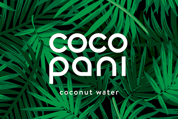 Coco Pani - Coconut water by Dan Buchan Design
 Coco Pani - Coconut water by Dan Buchan Design
Dan Buchanan Design knew that for Coco-Pani Conute Water to stand out in the saturated coconut water market, they would need something epic. Instead of opting for standard light, minimalistic packaging, this design house decided to take their client in the opposite direction, with a lush, leafy green design against a black background. This innovative look makes it stand out on shelves and makes it pop.
Supplement companies risk making their packaging too busy, with many of them leaning heavily on bright graphics and scientific jargon that doesn’t land properly with the average person. CreativeByDefinition, the design house for Owynna Curcumin Supplement, managed to make their client’s packaging both scientifically compelling and streamlined by creatively highlighting natural ingredients. The packaging is a simple white and orange design with black lettering and features a sweet potato superimposed against a pill. Of course, the implication is that the supplement will give you all of the nutrients of the sweet potato. It’s simple, elegant, and very effective.
CBD
CBD is a cannabis derivative that doesn’t get you high, but has tremendous health benefits and can offer a sense of serenity and well-being. It’s traveled far from the stoner fringes into the mainstream and has been adopted by plenty of soccer moms and suburban families as a go-to herbal remedy. Since the market is saturated, it’s nearly impossible to stand out. These companies managed to set themselves apart through incredible design.
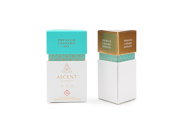 Ascent Extracts by Ellen Bruss Design
 Ascent Extracts by Ellen Bruss Design
Ascent Extracts worked with Ellen Bruss Design to create surprisingly glamorous packaging for their cannabis oil, evoking the ancient art of alchemy and wrapping up the whole package in a lush container with notes of turquoise and gold. The design is simple but bold and perfect for hitting the mark with the luxury CBD market.
When Colorado Born Branding & Packaging wanted to make CBD accessible and friendly, they turned to The Brand Chefs at Mighty Fudge Studios, who dished up a delicious concoction of simple design and bold colors. The end result was an accessible product that walked the line between practical and whimsical in a smart and modern way. Muted purples, blues, and greens adorn the packages, and the graphics are a play on the Sun. The look is sleek and easily duplicated for additional marketing materials.
As the wellness industry expands, we can expect to see even better and more dynamic designs come out of all corners.

 Peace & Presence Well-being by Lisa Winstanley
 Aura-Soma Rebrand by Tiny Hunter
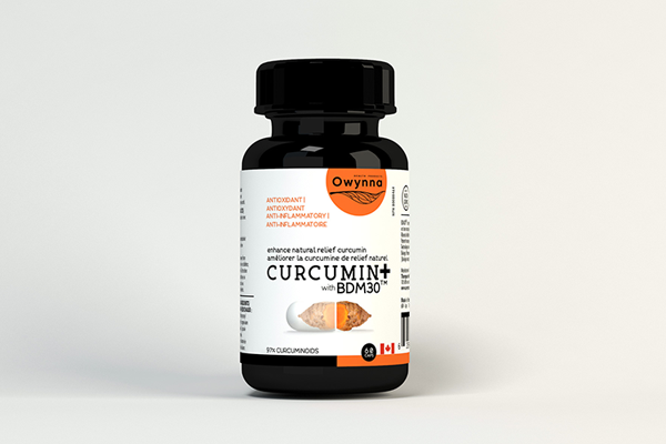 Owynna Curcumin Supplement by CreativeByDefinition
 Colorado Born Branding & Packaging by The Brand Chefs at Mighty Fudge Studios


